Kirby's Wrath Unleashed by Ex-Nintendo Devs
Author: Riley
Feb 21,2025

Exploring the Evolution of Kirby's Western Image: From "Angry Kirby" to Global Consistency

This article delves into the fascinating story behind Kirby's contrasting image in the US versus his original Japanese counterpart. Former Nintendo employees shed light on the strategic decisions behind the localization process and its evolution over time.
A Tougher Kirby for Western Markets?
The "Angry Kirby" phenomenon, as fans dubbed it, stemmed from a conscious effort to broaden Kirby's appeal in the West. Leslie Swan, former Nintendo Localization Director, clarified that the goal wasn't to portray anger, but rather a sense of determination. While cute characters resonate universally in Japan, the perception in the US leaned towards tougher characters appealing more to tween and teen boys. Shinya Kumazaki, director of Kirby: Triple Deluxe, corroborated this, highlighting the differing preferences between Japanese and US audiences. While cute Kirby drives engagement in Japan, a more battle-hardened Kirby resonated better in the US market. However, he noted exceptions, such as Kirby Super Star Ultra, which featured a tougher Kirby on both US and Japanese box art.
Marketing Kirby: Beyond "Kiddie" Games
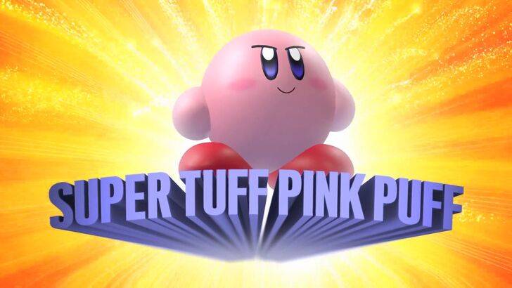
Nintendo's marketing strategy aimed to move beyond the "kiddie" label often associated with the company and its games. The "Super Tuff Pink Puff" tagline for Kirby Super Star Ultra exemplifies this shift. Krysta Yang, former Nintendo of America Public Relations Manager, highlighted the desire to cultivate a "cooler" image, acknowledging the stigma attached to the "kiddie" label. This strategy emphasized Kirby's combat abilities, aiming to attract a wider, older demographic. While recent marketing has focused less on personality and more on gameplay, Kirby's inherent cuteness remains a significant draw, particularly in the Japanese market.
Localization Choices: A Historical Perspective
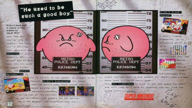
The divergence in Kirby's image began early, notably with a 1995 mugshot-style advertisement. Subsequent game box art often featured Kirby with sharper features and more intense expressions. Even the color palette differed; the initial Game Boy release of Kirby's Dreamland depicted a ghostly white Kirby, compared to his pink hue in the Japanese version. This decision, driven by the Game Boy's monochrome display, later proved to be a challenge, as a "puffy pink character" wasn't deemed commercially viable for a broader, particularly male, audience.
A More Global Approach
Both Swan and Yang agree that Nintendo has adopted a more globally consistent approach in recent years. Closer collaboration between Nintendo of America and its Japanese counterpart has led to more unified marketing and localization strategies. This shift aims to minimize regional variations, moving away from past instances like the 1995 "Play It Loud" campaign. While this fosters brand consistency, Yang acknowledges potential drawbacks, suggesting that a focus on global appeal may sometimes result in less distinctive, more "safe" marketing. The current trend, however, reflects the broader globalization of the gaming industry and the increasing familiarity of Western audiences with Japanese culture.