
Civ 7’s Deluxe Edition has just hit the market, sparking a flurry of online discussions about its user interface (UI) and other perceived shortcomings. But is the UI really as problematic as the internet suggests? Let's delve deeper into the game's UI components and evaluate the validity of these criticisms.
← Return to Sid Meier's Civilization VII main article
Is Civ 7's UI as Bad as They Say?
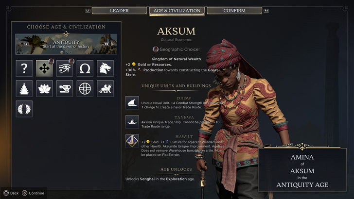
Civ 7, available to Deluxe and Founder’s Edition owners for just a day, is already facing criticism, particularly regarding its UI and the absence of certain quality-of-life features. While it's easy to join the chorus of detractors, a closer look is necessary to determine if the UI truly deserves such harsh judgment. Let's dissect the UI and evaluate it against the standards of a good 4X game interface.
What Makes a Good 4X UI?
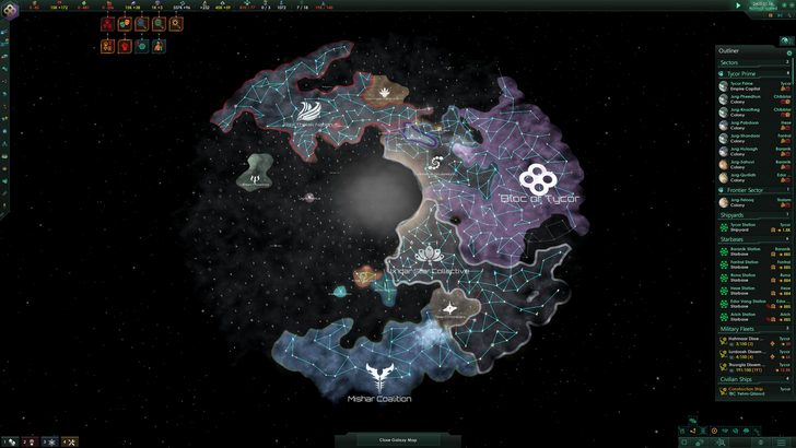
Defining a good 4X UI isn't straightforward, as design principles can vary based on the game's specific needs and style. However, experts have identified key elements that tend to be effective across various 4X games. Let's assess Civ 7's UI against these criteria.
Clear Information Hierarchy
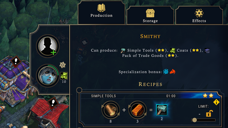
A well-designed 4X UI should prioritize information based on its relevance to gameplay. Essential resources and mechanics should be easily accessible, while less critical information should be available but not overwhelming.
For instance, Against the Storm's building info menus exemplify this principle. Each building's menu is organized into tabs that group information by frequency of use, making it easy for players to manage their resources efficiently.
Now, let's examine Civ 7's resource UI. It displays resource allocation across the empire in a structured table format with dropdowns for income, yields, and expenses. The UI offers detailed breakdowns by district and city, which is helpful. However, it lacks the granularity needed to pinpoint which specific districts or hexes are contributing to resource generation, and it doesn't provide a comprehensive breakdown of all expenses. While functional, Civ 7's resource UI could benefit from more detailed information.
Effective and Efficient Visual Indicators
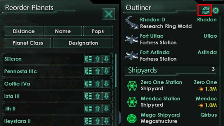
Visual indicators like icons and color coding are crucial for quickly conveying information in a 4X game. Stellaris' Outliner is a great example, using visual cues to show the status of survey ships and the needs of colonies at a glance.
Civ 7 uses iconography and numerical data to represent resources, and it includes useful overlays for tile yields and settlement viability. However, the absence of certain lenses from Civ 6, such as those for appeal and tourism, and the lack of customizable map pins, are notable drawbacks. While Civ 7's visual indicators are not ineffective, they could be enhanced to improve player experience.
Searching, Filtering, and Sorting Options
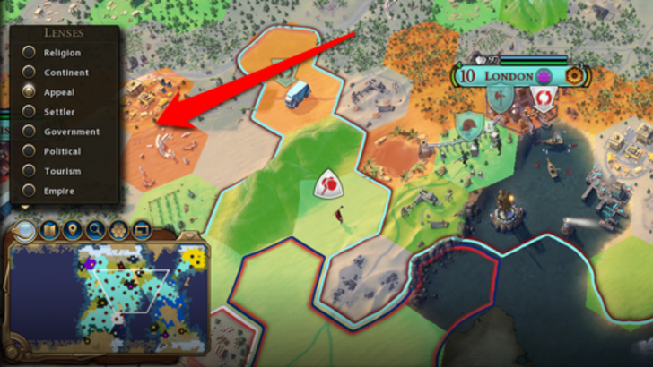
As games grow in complexity, the ability to search, filter, and sort information becomes vital. Civ 6's search function, which allows players to locate specific resources or map features, is a model of efficiency.
Unfortunately, Civ 7 lacks this crucial search function, which significantly impacts usability. Players are left without a way to quickly locate specific elements on the map, a feature that could greatly enhance the gameplay experience. Hopefully, future updates will address this issue.
Design and Visual Consistency
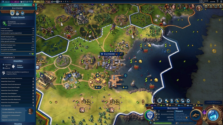
The visual design and consistency of a UI are crucial for player engagement. Civ 6's UI, with its cartographical style, integrates seamlessly with the game's aesthetic, enhancing the overall experience.
Civ 7 opts for a more minimalist and sophisticated look, using a restrained color palette and simplified iconography. While this design choice aligns with the game's theme of regality and refinement, it may not resonate with all players due to its subtlety. The UI's design is not amateurish but rather a deliberate choice that some may find less engaging than Civ 6's more vibrant style.
So What’s the Verdict?
It’s Not The Best, But Undeserving of Such Disapproval
After evaluating Civ 7's UI against the key criteria for a good 4X interface, it's clear that while it has room for improvement, it's not nearly as bad as some claim. The lack of a search function is a significant oversight, but other aspects of the UI, such as its resource display and visual indicators, are functional if not exemplary.
The game's overall strengths outweigh the UI's imperfections, and with future updates and player feedback, Civ 7's UI could improve significantly. In its current state, it's not the best in class, but it's far from the disaster some have made it out to be.
← Return to Sid Meier's Civilization VII main article
Sid Meier's Civilization VII Similar Games


